
The “Average” Trap: Your Analysis Might Be Wrong (And You Won’t Even Notice)
It's much more common than you think

How often do you lose sleep over calculating averages?
It’s a rhetorical question by the way…
Basic statistics for us Data Scientist is second nature
We are often burdened with much tougher decisions, like choosing the right statistical test for our next A/B test or pushing feature engineering to its limits just to squeeze out that extra 0.1% boost in model accuracy.
But whether we like it or not, careless mistakes often sneak into our analysis
You might think that calculating averages (means) is as simple as adding numbers together and then dividing by the number of numbers. Except, it is not.
And this becomes a bigger issue when we introduce non-technical stakeholders into the mix.
Which happens..well, always
And yes, although Why is this even an issue if no one is calculating averages by hand? is a valid question—thanks for asking, by the way—the actual problem isn’t in the mathematical formula itself but in how it’s often applied where it shouldn’t.
Here is what we’ll cover:
Breaking it down: The core of the issue
Spotting the problem: Two real-world examples you’ve probably seen before
Fixing it: The only way to handle this properly
Key takeaways: What to remember moving forward
It’s simple…to make mistakes 😢
Mathematically, a simple mean is:
which assumes each observation contributes equally.
But in the real world, assuming every value carries equal weight can be a big mistake, especially when data points represent different sample sizes (like for example data grouped by country).
If you ignore this and apply a simple average to pre-aggregated data, you risk misrepresenting the true distribution.
Watch out for this! ⚠️
Over the years of working in data analytics, I’ve noticed two scenarios that often lead to this mistake
Scenario #1: Data teams pre-aggregating too much in BI datasets
In an effort to reduce computation costs and improve query performance, data teams pre-aggregate metrics in the data warehouse, creating tables that makeup what’s commonly known as the “data mart”.
These tables are usually used directly in analysis or connected to BI tools to create dashboards.
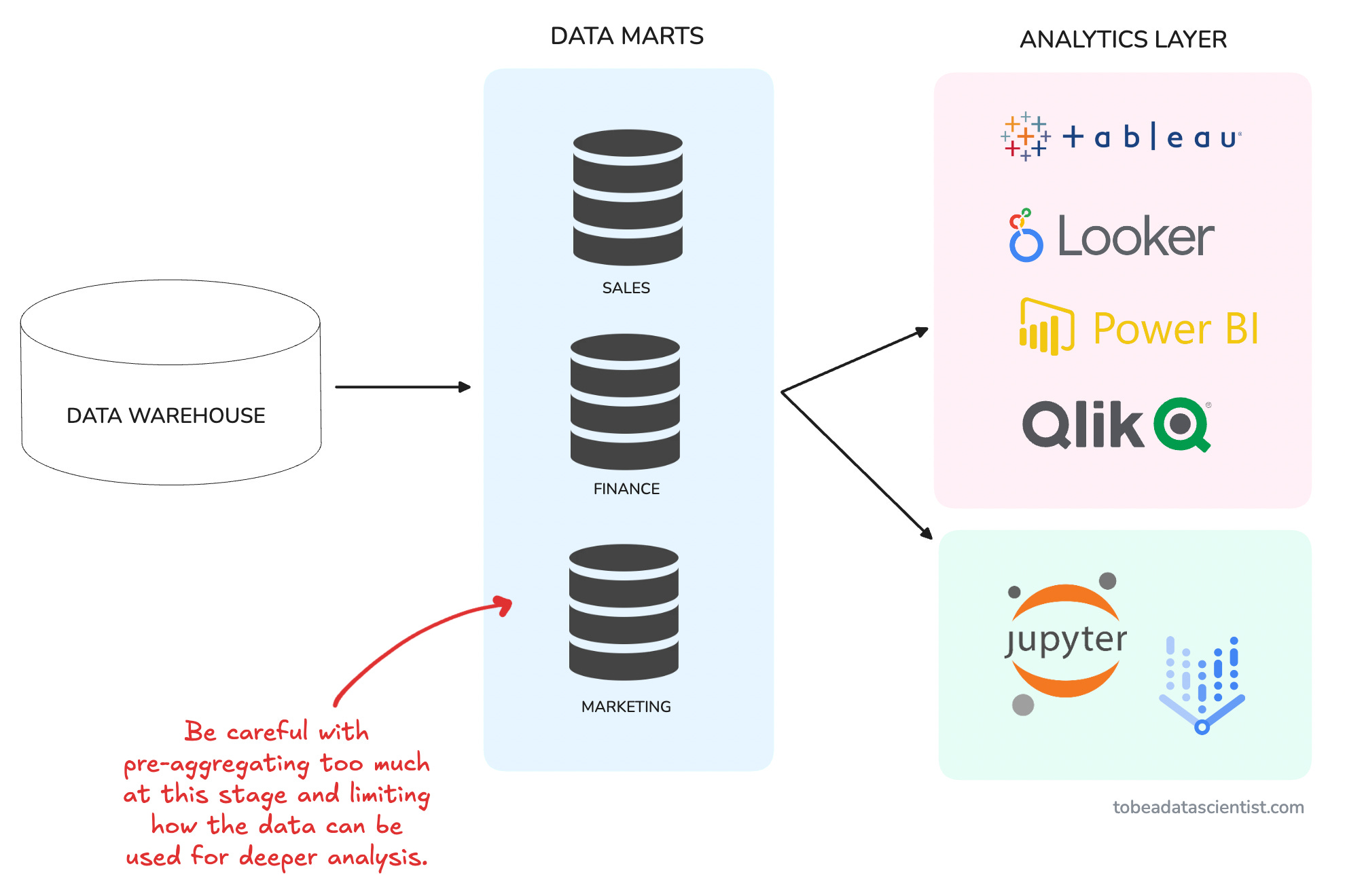
The problem is that there is no one-size-fits-all, and later analyses (or dashboards) often require more flexibility.
💡 Imagine creating a table with pre-aggregated customer ratings per city, which data scientists or analysts then average again without weighting for the number of reviews.
But there’s an even more common (and frustrating) scenario out there…
Scenario #2: Stakeholders aggregating already-aggregated data
This is all too common, and the worst part is that it's somewhat out of your control.
You create a shiny new dashboard for your stakeholders, and they love it—at first.
Until the day they decide the dashboard doesn’t quite meet all of their needs, so they do what’s most natural to them, hit download as a CSV and load the data into Excel.
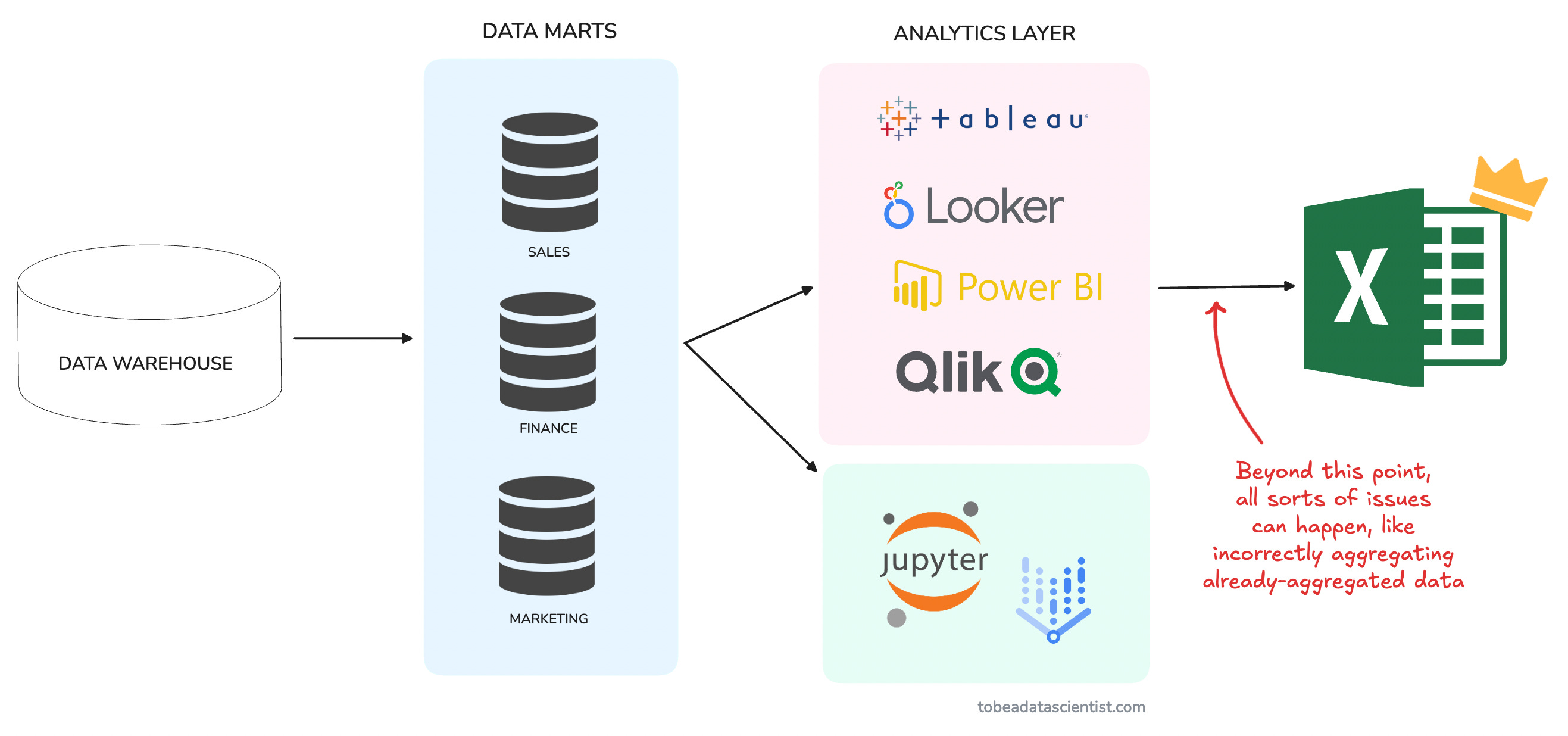
This is where it all goes wrong…
💡 Imagine stakeholders taking an average of monthly ARPUs to estimate quarterly ARPU instead of dividing total revenue by total users for the period.
The original aggregation may already have weighting factors that get ignored in the second aggregation.
Sadly, I’ve seen this happen in real life.
Enter, the Weighted Average 🧠
I know you probably learned this in school, but a refresher never hurts!
A weighted average is designed to give more influence to values with larger sample sizes. Instead of assuming equal importance, it adjusts for the number of observations behind each value.
Where:
For example,
Let’s say you’re analyzing “average session duration per country” for a global app and you get the following data:
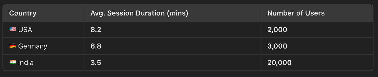
❌ A simple average (incorrect method) would be:
But this wrongly assumes each country contributes equally.
✅ Using the Weighted Average (correct method), we apply:
A simple mean overestimates the average session duration because it ignores the fact that India has the most users. The weighted average corrects this distortion, giving a more realistic result.
And in this case, the difference between 6.17 minutes and 4.5 minutes is quite significant.
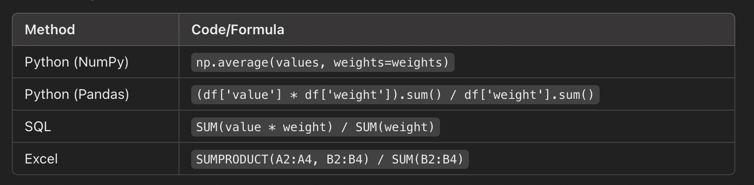
So how would you (actually) apply this formula in practice?
Here is a breakdown showing how applying this formula would look like depending on the tool you are working with:
Quick Takeaways
Never average averages, always check if weights matter (hint: most of the time they do)
Go back to raw data whenever possible (This should be your default)
Teach stakeholders to avoid this mistake.
📣 Quick announcement
I’m doing a free live Q&A for my paid subscribers:

What other perks do you get as a paid subscriber?
Full access to all public + premium posts.
A free copy of my Data Science Project Ideas PDF.
A 25% off coupon for a 1:1 mentoring session.
Occasional live Q&As and exclusive workshops.
Upgrade now, and you’ll only pay $4/month for as long as you stay subscribed. This offer ends soon.
Thank you for reading! I hope you found these tips insightful.
See you next week!
- Andres
Before you go, please hit the like ❤️ button at the bottom of this email to help support me. It truly makes a difference!
Great advice!
Great article and in Weighted Average formula picture, it misses the add sign for sum of weight.